Saturday, 28 November 2015

Reportage Rotation


"Many will visit the National Theatre to see a play, but perhaps equally attractive is the imposing Brutalist architecture of the site including the striking ‘Red Shed’ temporary theatre. Just a short walk from Waterloo, the National is home to many hidden treasures including a roof top garden and independent cafĂ©."

Research + Inspiration

After my initial visits to the National Theatre, I looked for work that might inspire me. I wanted to get across the collage of my sketchbook work but in a cleaner more finished way.

My approach was really inspired by Atelier Bingo, their work heavily references Matisse in terms of colour and the shapes they use. I love their stuff! I think particularly their composition is really interesting and quite unique - it's always unexpected. The shapely shapes are wonderful and I love the mix of pattern and texture. 


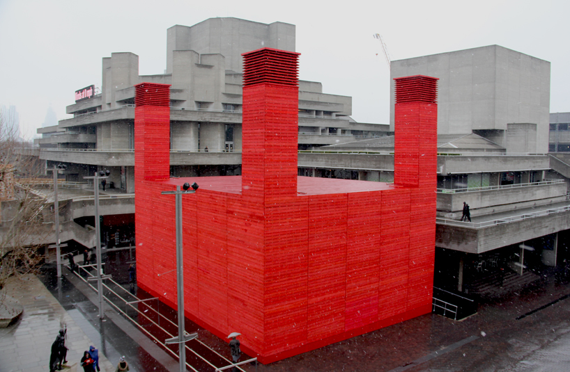
These photos aren't mine (they should link through to their sources) but as it was very, very drizzly during my visits these are much better quality. My favourite thing about the National Theatre currently is the temporary theatre. The big lego brick of red is so appealing visually, it's so solid compared to the more fractured structure of the Lower Marsh site.

As well as the famous Olivier statue, there is 'London Pride'. There's some interesting information about the statue here. It's a reference to the South Bank exhibition and fits nicely with the Modernist architecture around it. I think they make a nice symbol of the cultural atmosphere. Chilling + chatting. 

Making
My design focuses on the Red Shed + the Brutalist elements of the building. I wanted to use the colours of the site: red, grey, black, and white. Because of the way the building was made it has lots of great texture, so I scanned all my rubbings and collages from my sketchbook.


I started by adding a crayon texture for my background. Then I added a red overlay and played with settings to make a nice textured deep red backdrop.


 I had a rough sketch to work off of but I decided to play with the layout a bit. In the end going to the bottom right one.


I scanned in all my bits and cut them out on Photoshop. Then I pasted in all my bits and began playing with the composition! 

It was really great working that way, I loved moving things around. 


These ladies are my favourite! I think I did a good job at recreating them. :^)


Critique + Feedback

I'm very happy with what I made! I wrote the text before the image so I think they link together well. I think it needs more signposts for the location of the theatre, for example the river or Waterloo station. Maybe it needs to look more theatre-y? I feel like if you see the theatre it makes sense, but... the people reading this article most likely have not seen the theatre. I think also it needs more people to give a sense of scale. 

This is the feedback I got:
  • "Image goes really well with the text"
  • "1. The image is composed of various collaged shapes, rubbings, trees/plants. Its very abstract + uses motif/shapes to describe. 2. It has a sense of the 50s when the theatre was built conveyed in the shapes + composition. 3. It tells me something but not too much - maybe this was the intention?"
  • "Always you've got lovely colour, feel happy & empty, calm. 2. Hard to know where it is. So, if draw more information and built it like people"
  • "1. yard/buildings/statues? 2. Really unique. Using her own style, which makes the work standing out. There've not many abstract works but this is. 3. Text could be more coherent with the picture?"
  • "A more graphic, abstract approach, shows your own style. 2. Use of colour, industrial looking fits with the building + its function. 3. Could make it a little more obvious - but don't need to"
  • "Good to try the 'graphical' style of illustration. Really highlight the place with the use of colours."
  • "1 Looks like plants inside a building 2. Cute style of collage. I can tell who did it. I like the monochromatic colour scheme and composition of the image. 3. Without the text I wouldn't be able to know it was a theatre, mabe a black square might help for the backdrop"
  • "1. Arcetectural space 2. effective use of simple shapes and limited colour to depict a complicated space 3. text could be bigger just so easier to read"
  • "Like the range of textures and select colours used - sucessful final image - like the nipply people"
  • "Image depicting the National Theatre. Very interesting use of abstract imaging, good use of colour - excellent composition"
  • "Graphic interpretation of a place 2. The colours and static images give a busy feel but not chaotic because of large amounts of white space 3. More National Theatre imagery could help because its hard to tell what place it is"
  • "Very convincing image along with the text, good composition, perhaps one more colour"
  • "Interesting composition wouldn't have known where the piece was about without hte written description"


Thursday, 26 November 2015

Editorial Rotation

(n.b: This was supposed to be published many moons ago.)

Week One!


Ok, so I was super sick this week. I'm really not happy with how it all worked out so I'm going to work on my ideas and re-do it for the assessment! 

The most successful thing I did was this series of collages: 


These were based off the word 'vulnerable'. My new final piece will definitely try to get across this same kind of, I guess I would call it boldness. Talking to Luke about them, I mentioned that this is the way I'm most comfortable working. He said that on quick projects like his it's sometimes best to stick to what you know works. I think he's right, my overall problem with both pieces I made I was trying something new with a deadline looming over me. (I also think I actually like to work quite slowly.)

My two roughs ended up being these: 


They're a little shit, I really don't think my brain was working in this project - but I thought I had whooping cough so, ya know. I actually didn't get Luke's criticism of it until after I had finished the final piece, due to email error, but I will definitely be using it in my re-do.

Regarding my final piece, I actually really like the colours and that one painting of a football boot. (I think Kyle Platts drew something similar?) Other than that my limited lung capacity shows. I'm going to just abandon football references and focus on the buildings and the idea of shelter. 


Week 2!

I was feeling a bit better this week! I eventually made it to the afternoon of Luke's workshop, it was really helpful to talk about what when tits up in week 1 and then discuss ideas for the second article. I decided to focus on the overcrowding issue discussed. Almost straight away I had an idea for an image and played around with different ways of making it look alright. 


These are my two roughs, one is a pattern the other is a crowded sea. My feedback was that the pattern doesn't really work, and that the second image needs more people in it. I bought a graphics tablet recently so I'm going to try and use that and work digitally for the first time in yonks. I started by painting my surfers. I really hated how the water looked so decided to do that digitally:


First I deleted all the crap. :^) Very therapeutic. 


I really didn't like how the surfboards looked so I deleted them and replaced them with yellow ones!


They look like people caught in an avalanche. After adding the surfboards I was left with this:


I actually love how this looks! But I think the water is important. I was also not satisfied by how many people I had, so I scanned in some of the other drawings and pasted them in. I think I ended up with a decent density of dudes and divers. 

Next I wanted to think about the water, I trialled a number of solutions:


I think it's quite obvious I'm not skilled with a graphics tablet yet, but I like some of the results. I like the grid pattern a lot, the article references how the surfing may have to take place in a pool - which would suck! I don't think it looks quite right though.

I came across this image of David Hockney painting his pool, and the interplay of lines is amazing! I decided to reference that but a little chunkier:


I think it looks good! In the end I got this:


I have a lot of criticisms for this piece, but overall I don't mind it too much. I still think it needs more people in it, maybe I should have made them larger to begin with.


Monday, 2 November 2015

CORE Final Piece Evaluation + Overview


The story I chose to illustrate was Mary Kingsley's encounter with a leopard, she came upon the big cat in the midst of a tornado. I was drawn to this particular passage because of the detailed description and heightened drama. I chose to do a large A0 piece using collage. I wanted to convey the kind of 'ordered chaos' Kingsley describes. 

Research
My initial core research took me to Kew Gardens, The British Museum, Natural History Museum, and the Horniman Museum. I also drew the riverside in Kingston-upon-Thames. These initial drawings were really very useful for the project, I think I underestimated how useful an image bank could be. Some of the research I ended up not using, particularly the drawings of animals. My plant research at Kew Gardens was probably the most useful for me. 

This initial research sparked my interest into the peoples met by Mary Kingsley, particularly the Fang peoples. I learnt about how important pottery is in West African societies, traditionally speaking it's a female craft - strongly associated with spirituality, midwifery, and 'big' ideas like time, death, and birth. I knew that I wanted to reference this research in my final piece. Some of my visual references included artists such as Matisse, Laura Carlin, and Sarah Burwash. 

Workshop


The book making workshop was so fun! In particular what I took from this workshop was: tracing paper, painted collage paper, and the story I wanted to use. I think it helped me to condense my image bank to the bits that were most impactful/useful/good. 


Feedback

The feedback I got from the crit day was really useful, I have the original notes in my sketchbook but here are bits from our discussion:
  • Wanted to convey order + chaos
  • Like how I layered the tracing paper
  • Can immediately tell that it's wind moving from the white strips of paper and the shape of the leaves
  • The leopard is very inconspicuous as well as Mary - they're hidden, in contrast to the huge powerful storm. 
  • They liked the contrast and composition and the different shapes of plants, converying the chaos of the jungle
  • Like how I made one side still and one side violent.
  • Could the pot be a darker colour? 
  • Could the pots position be improved by shifting it to the left? 
  • Mary might want to be in a different position too.
  • Love Mary's character design! Her long neck shows a curious personality. 
It was good seeing other people's take on the same book as well, really interesting how diverse the results could be. 


Overall...
I really like elements of this piece. There are areas I want to improve are the 'storminess' of the pot/tornado area of the piece. I think I needed to experiment further with the tracing paper, I didn't really use it as much as I could have. It would have been a good way to make mistakes without 'ruining' the piece. 

Overall I've loved working with collage on this scale, I like working on large pieces and this was particularly challenging with the amount of detail and the composition involved. The colours are yummy and definitely give a jungle feel, but slightly cute and story book-like.

The Pot


This is a little (ha.) extra project I'm doing. The history of ceramics in West Africa was really fascinating, I really wanted to make something referencing the things I learnt. Plus I get to challenge myself, I've never made a coil pot this big! It's going to be interesting. When I am decorating it I'm hoping to use stencils to get the same 'cut-out' effect as the collage.