(n.b: This was supposed to be published many moons ago.)
Week One!

Ok, so I was super sick this week. I'm really not happy with how it all worked out so I'm going to work on my ideas and re-do it for the assessment!
The most successful thing I did was this series of collages:

These were based off the word 'vulnerable'. My new final piece will definitely try to get across this same kind of, I guess I would call it boldness. Talking to Luke about them, I mentioned that this is the way I'm most comfortable working. He said that on quick projects like his it's sometimes best to stick to what you know works. I think he's right, my overall problem with both pieces I made I was trying something new with a deadline looming over me. (I also think I actually like to work quite slowly.)
My two roughs ended up being these:


They're a little shit, I really don't think my brain was working in this project - but I thought I had whooping cough so, ya know. I actually didn't get Luke's criticism of it until after I had finished the final piece, due to email error, but I will definitely be using it in my re-do.
Regarding my final piece, I actually really like the colours and that one painting of a football boot. (I think Kyle Platts drew something similar?) Other than that my limited lung capacity shows. I'm going to just abandon football references and focus on the buildings and the idea of shelter.
Week 2!
I was feeling a bit better this week! I eventually made it to the afternoon of Luke's workshop, it was really helpful to talk about what when tits up in week 1 and then discuss ideas for the second article. I decided to focus on the overcrowding issue discussed. Almost straight away I had an idea for an image and played around with different ways of making it look alright.


These are my two roughs, one is a pattern the other is a crowded sea. My feedback was that the pattern doesn't really work, and that the second image needs more people in it. I bought a graphics tablet recently so I'm going to try and use that and work digitally for the first time in yonks. I started by painting my surfers. I really hated how the water looked so decided to do that digitally:

First I deleted all the crap. :^) Very therapeutic.

I really didn't like how the surfboards looked so I deleted them and replaced them with yellow ones!

They look like people caught in an avalanche. After adding the surfboards I was left with this:

I actually love how this looks! But I think the water is important. I was also not satisfied by how many people I had, so I scanned in some of the other drawings and pasted them in. I think I ended up with a decent density of dudes and divers.
Next I wanted to think about the water, I trialled a number of solutions:


 I think it's quite obvious I'm not skilled with a graphics tablet yet, but I like some of the results. I like the grid pattern a lot, the article references how the surfing may have to take place in a pool - which would suck! I don't think it looks quite right though.
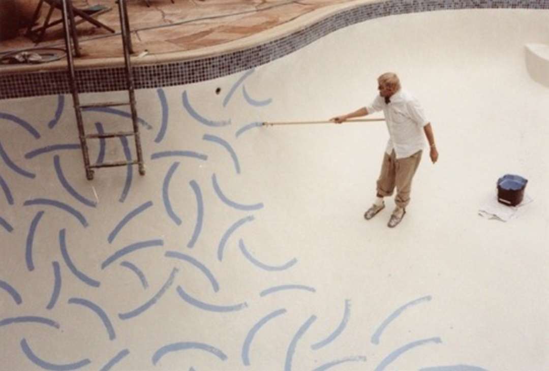
I came across this image of David Hockney painting his pool, and the interplay of lines is amazing! I decided to reference that but a little chunkier:


I think it looks good! In the end I got this:

I have a lot of criticisms for this piece, but overall I don't mind it too much. I still think it needs more people in it, maybe I should have made them larger to begin with.
No comments:
Post a Comment