Wednesday, 9 December 2015

FactFilmPoem Final Piece


Yay! It's done!
I'm very happy with the final cut, although every time I watch it I feel another thing I want to nitpick. That's fun for the first hour - not so much after that. 

I enjoyed this project a lot more than I thought I would, it was kind of like making a collage but with moving image - super fun.

My video is all about contrapposto, described in the Encylopaedia Brittanica as:

"Contrapposto, (Italian: “opposite”), in the visual arts, a sculptural scheme, originated by the ancient Greeks, in which the standing human figure is poised such that the weight rests on one leg (called the engaged leg), freeing the other leg, which is bent at the knee. With the weight shift, the hips, shoulders, and head tilt, suggesting relaxation with the subtle internal organic movement that denotes life." 
I wanted to play with the ideas of movement vs. stillness, expressive vs. stoic, classical vs. archaic. I reference old documentaries in terms of colour and ~ironic~ font choice. My background music comes from Drake's Hotline Bling, it's got a great rhythm to it - it's the kind of thing that makes me want to dance which is why I chose it. I got my images from research into contrapposto sculpture, then my moving images from clips of films I like. (Funny Face, Breathless, Moonrise Kingdom, Fred Astaire dancing, Pulp Fiction, Magical Mystery Tour) They're from a similar time period, or reference that period, so have a nice aesthetic that brings them all together.

I found that the video research I did was really useful, and fed into the final piece, particularly the Arrangements series by Jin Angdoo. The editing between arrangements is very simple, but timed with the music making it have a bigger impact. In Bill Viola's Inner Passage, I love the use of the black border and so utilised it in my own piece. It makes each video collage stand as an individual but also gives a sense of continuity - like frames on photos. It also help give dynamics, no black border for loud bit (TWIST) and larger borders for the quieter ending. Super helpful!

The feedback day was really invaluable, not only with the feedback I got but watching everybody else's videos was really interesting and useful. It allowed a degree of separation between me and the baby (the video) so I could look at it more critically without feeling bad about it. Some of the ideas other people used I pinched too, like finishing with just audio playing was really effective. For me it stops my video feeling too abrupt, which was a part of the feedback.

These are some of the changes I've made since the draft:
  • I adjusted the volume, making it louder after the drop at 'and a'. It's much more dramatic now! 
  • I made the text into a sentence (more of less): 'Contrapposto: organic dynamic movement. It's a .... *John Travolta* ... and a TWIST. It's a counterpoint.'
  • I changed the colour of the twist text, I think the yellow is just a bit stronger and more striking. I trialled pink, red, and yellow (and alternating between the three - but that was fit inducing) and it was the best.
  • I cleaned up the pacing and made it a snappier, making sure clips start on. the. beat. like. this. Makes a huge different!
  • I moved Jean Seburg around, she appears twice now. The second time she does this really curious hand movement that we discussed in the crit, it makes the second clip a bit weird, a bit different. (A twist geddit)
  • I added Audrey Hepburn to the end again, but much smaller and reversed. The curtain goes down on her, signalling the end of the film.
I decided against adding a voice over, it might have been fun if I had the right person to do it but sadly Bill Murray is not available. Ultimately I like the audio as it is. 

FactFilmPoem Draft!


That's my draft right there. Yesterday I got some really great feedback on it, overall people really seemed to enjoy it:

  • Split screen works well!
  • The font is good - kind of ugly and ironic. Have a look at Mel Brook's High Anxiety for more great yellow fonts. The yellow and red fonts seem to work best!
  • Last frame is a bit weird to end on - do you need it? It's a bit of a breather but feels like too much of a comedown after the rest of the film. Maybe it needs something afterwards. They were kind of shocked it ended there. Some suggested moving it to the beginning although they really liked the opening shot! There's an interesting hand action she does that you could use in a repeat, so it makes more sense as a counterpoint.
  • The text throughout should form more of a sentence so it makes more of a thread through the film. Play with the text a bit more - have it flash on and off or something.
  • Twist section needs to be a bit more impactful!
  • Maybe to bulk it up you could play some sections (Audrey Hepburn for example) backwards - like the counterpoint clip.
  • The silent sections are good!
  • Could somebody be doing a voiceover? 'Contrapposto' in Tom Waits voice, imagine!
I'm now going to work on these and come back with a final piece! (or maybe a couple of drafts then a final piece.)

Sunday, 6 December 2015

Video Research

Ralph Steiner Mechanical Principles


What I really like about this is how the closely cropped images of machinery break up the screen creating areas of movement and contrasting areas of stillness, for example 2.37 + 3.41. I think being in black and white definitely adds to that effect, and also gives a continuity to the film despite the variety of forms. The way this has been shot gives recognisable images a new meaning, some become almost anthropomorphic - particularly at 5.02, with the machine picking up and dropping the weight. The pace is largissimo, generous and leisurely. The string score makes the slow + smooth movements weirdly hypnotising.

Bill Viola: Inner Passage


The use of a tall frame in this film is very striking, it's claustrophobic - I associate it with iPhone filming, found footage + home videos. But it also suggests emptiness, particularly with the shots that book end this film of the figure in the desert. They also enhance the story telling, scenes of dryness contrasting with an overall theme of water. It's quite nightmare-like in parts, lots of different images but all very haze and dreamlike. The water featured is both violent and calm. The quick shots are SO arresting when followed by the still lake, the use of slow cross fades helps with this effect.

A Brief History of John Baldessari


This is John Baldessari's documentary.
It's fantastic! So funny! It mimics that kind of old fashioned documentary, Jacque Cousteau type films. The contrast of ~serious~ artistic analysis with 'These are John Baldessari's push pins.' The score is dramatic and the text follows so wonderfully. I love that John Baldessari is present throughout. The repetition of his name is really funny and something I want to do with ~contrapposto~ they're so good sounding!

This is just a beginning! More to follow ~


Saturday, 28 November 2015

Reportage Rotation


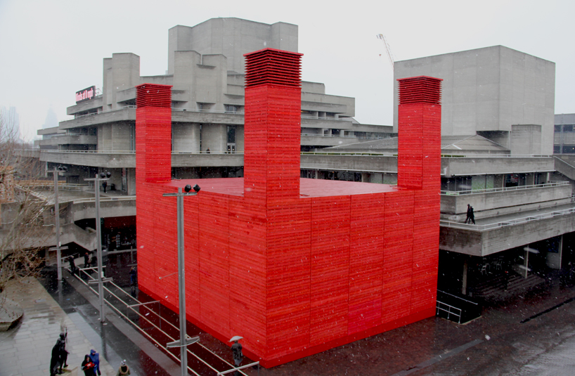
"Many will visit the National Theatre to see a play, but perhaps equally attractive is the imposing Brutalist architecture of the site including the striking ‘Red Shed’ temporary theatre. Just a short walk from Waterloo, the National is home to many hidden treasures including a roof top garden and independent cafĂ©."

Research + Inspiration

After my initial visits to the National Theatre, I looked for work that might inspire me. I wanted to get across the collage of my sketchbook work but in a cleaner more finished way.

My approach was really inspired by Atelier Bingo, their work heavily references Matisse in terms of colour and the shapes they use. I love their stuff! I think particularly their composition is really interesting and quite unique - it's always unexpected. The shapely shapes are wonderful and I love the mix of pattern and texture. 


These photos aren't mine (they should link through to their sources) but as it was very, very drizzly during my visits these are much better quality. My favourite thing about the National Theatre currently is the temporary theatre. The big lego brick of red is so appealing visually, it's so solid compared to the more fractured structure of the Lower Marsh site.

As well as the famous Olivier statue, there is 'London Pride'. There's some interesting information about the statue here. It's a reference to the South Bank exhibition and fits nicely with the Modernist architecture around it. I think they make a nice symbol of the cultural atmosphere. Chilling + chatting. 

Making
My design focuses on the Red Shed + the Brutalist elements of the building. I wanted to use the colours of the site: red, grey, black, and white. Because of the way the building was made it has lots of great texture, so I scanned all my rubbings and collages from my sketchbook.


I started by adding a crayon texture for my background. Then I added a red overlay and played with settings to make a nice textured deep red backdrop.


 I had a rough sketch to work off of but I decided to play with the layout a bit. In the end going to the bottom right one.


I scanned in all my bits and cut them out on Photoshop. Then I pasted in all my bits and began playing with the composition! 

It was really great working that way, I loved moving things around. 


These ladies are my favourite! I think I did a good job at recreating them. :^)


Critique + Feedback

I'm very happy with what I made! I wrote the text before the image so I think they link together well. I think it needs more signposts for the location of the theatre, for example the river or Waterloo station. Maybe it needs to look more theatre-y? I feel like if you see the theatre it makes sense, but... the people reading this article most likely have not seen the theatre. I think also it needs more people to give a sense of scale. 

This is the feedback I got:
  • "Image goes really well with the text"
  • "1. The image is composed of various collaged shapes, rubbings, trees/plants. Its very abstract + uses motif/shapes to describe. 2. It has a sense of the 50s when the theatre was built conveyed in the shapes + composition. 3. It tells me something but not too much - maybe this was the intention?"
  • "Always you've got lovely colour, feel happy & empty, calm. 2. Hard to know where it is. So, if draw more information and built it like people"
  • "1. yard/buildings/statues? 2. Really unique. Using her own style, which makes the work standing out. There've not many abstract works but this is. 3. Text could be more coherent with the picture?"
  • "A more graphic, abstract approach, shows your own style. 2. Use of colour, industrial looking fits with the building + its function. 3. Could make it a little more obvious - but don't need to"
  • "Good to try the 'graphical' style of illustration. Really highlight the place with the use of colours."
  • "1 Looks like plants inside a building 2. Cute style of collage. I can tell who did it. I like the monochromatic colour scheme and composition of the image. 3. Without the text I wouldn't be able to know it was a theatre, mabe a black square might help for the backdrop"
  • "1. Arcetectural space 2. effective use of simple shapes and limited colour to depict a complicated space 3. text could be bigger just so easier to read"
  • "Like the range of textures and select colours used - sucessful final image - like the nipply people"
  • "Image depicting the National Theatre. Very interesting use of abstract imaging, good use of colour - excellent composition"
  • "Graphic interpretation of a place 2. The colours and static images give a busy feel but not chaotic because of large amounts of white space 3. More National Theatre imagery could help because its hard to tell what place it is"
  • "Very convincing image along with the text, good composition, perhaps one more colour"
  • "Interesting composition wouldn't have known where the piece was about without hte written description"


Thursday, 26 November 2015

Editorial Rotation

(n.b: This was supposed to be published many moons ago.)

Week One!


Ok, so I was super sick this week. I'm really not happy with how it all worked out so I'm going to work on my ideas and re-do it for the assessment! 

The most successful thing I did was this series of collages: 


These were based off the word 'vulnerable'. My new final piece will definitely try to get across this same kind of, I guess I would call it boldness. Talking to Luke about them, I mentioned that this is the way I'm most comfortable working. He said that on quick projects like his it's sometimes best to stick to what you know works. I think he's right, my overall problem with both pieces I made I was trying something new with a deadline looming over me. (I also think I actually like to work quite slowly.)

My two roughs ended up being these: 


They're a little shit, I really don't think my brain was working in this project - but I thought I had whooping cough so, ya know. I actually didn't get Luke's criticism of it until after I had finished the final piece, due to email error, but I will definitely be using it in my re-do.

Regarding my final piece, I actually really like the colours and that one painting of a football boot. (I think Kyle Platts drew something similar?) Other than that my limited lung capacity shows. I'm going to just abandon football references and focus on the buildings and the idea of shelter. 


Week 2!

I was feeling a bit better this week! I eventually made it to the afternoon of Luke's workshop, it was really helpful to talk about what when tits up in week 1 and then discuss ideas for the second article. I decided to focus on the overcrowding issue discussed. Almost straight away I had an idea for an image and played around with different ways of making it look alright. 


These are my two roughs, one is a pattern the other is a crowded sea. My feedback was that the pattern doesn't really work, and that the second image needs more people in it. I bought a graphics tablet recently so I'm going to try and use that and work digitally for the first time in yonks. I started by painting my surfers. I really hated how the water looked so decided to do that digitally:


First I deleted all the crap. :^) Very therapeutic. 


I really didn't like how the surfboards looked so I deleted them and replaced them with yellow ones!


They look like people caught in an avalanche. After adding the surfboards I was left with this:


I actually love how this looks! But I think the water is important. I was also not satisfied by how many people I had, so I scanned in some of the other drawings and pasted them in. I think I ended up with a decent density of dudes and divers. 

Next I wanted to think about the water, I trialled a number of solutions:


I think it's quite obvious I'm not skilled with a graphics tablet yet, but I like some of the results. I like the grid pattern a lot, the article references how the surfing may have to take place in a pool - which would suck! I don't think it looks quite right though.

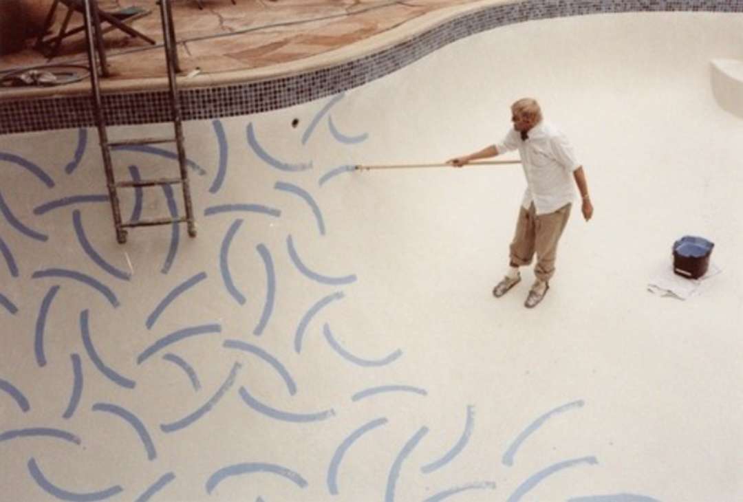
I came across this image of David Hockney painting his pool, and the interplay of lines is amazing! I decided to reference that but a little chunkier:


I think it looks good! In the end I got this:


I have a lot of criticisms for this piece, but overall I don't mind it too much. I still think it needs more people in it, maybe I should have made them larger to begin with.


Monday, 2 November 2015

CORE Final Piece Evaluation + Overview


The story I chose to illustrate was Mary Kingsley's encounter with a leopard, she came upon the big cat in the midst of a tornado. I was drawn to this particular passage because of the detailed description and heightened drama. I chose to do a large A0 piece using collage. I wanted to convey the kind of 'ordered chaos' Kingsley describes. 

Research
My initial core research took me to Kew Gardens, The British Museum, Natural History Museum, and the Horniman Museum. I also drew the riverside in Kingston-upon-Thames. These initial drawings were really very useful for the project, I think I underestimated how useful an image bank could be. Some of the research I ended up not using, particularly the drawings of animals. My plant research at Kew Gardens was probably the most useful for me. 

This initial research sparked my interest into the peoples met by Mary Kingsley, particularly the Fang peoples. I learnt about how important pottery is in West African societies, traditionally speaking it's a female craft - strongly associated with spirituality, midwifery, and 'big' ideas like time, death, and birth. I knew that I wanted to reference this research in my final piece. Some of my visual references included artists such as Matisse, Laura Carlin, and Sarah Burwash. 

Workshop


The book making workshop was so fun! In particular what I took from this workshop was: tracing paper, painted collage paper, and the story I wanted to use. I think it helped me to condense my image bank to the bits that were most impactful/useful/good. 


Feedback

The feedback I got from the crit day was really useful, I have the original notes in my sketchbook but here are bits from our discussion:
  • Wanted to convey order + chaos
  • Like how I layered the tracing paper
  • Can immediately tell that it's wind moving from the white strips of paper and the shape of the leaves
  • The leopard is very inconspicuous as well as Mary - they're hidden, in contrast to the huge powerful storm. 
  • They liked the contrast and composition and the different shapes of plants, converying the chaos of the jungle
  • Like how I made one side still and one side violent.
  • Could the pot be a darker colour? 
  • Could the pots position be improved by shifting it to the left? 
  • Mary might want to be in a different position too.
  • Love Mary's character design! Her long neck shows a curious personality. 
It was good seeing other people's take on the same book as well, really interesting how diverse the results could be. 


Overall...
I really like elements of this piece. There are areas I want to improve are the 'storminess' of the pot/tornado area of the piece. I think I needed to experiment further with the tracing paper, I didn't really use it as much as I could have. It would have been a good way to make mistakes without 'ruining' the piece. 

Overall I've loved working with collage on this scale, I like working on large pieces and this was particularly challenging with the amount of detail and the composition involved. The colours are yummy and definitely give a jungle feel, but slightly cute and story book-like.

The Pot


This is a little (ha.) extra project I'm doing. The history of ceramics in West Africa was really fascinating, I really wanted to make something referencing the things I learnt. Plus I get to challenge myself, I've never made a coil pot this big! It's going to be interesting. When I am decorating it I'm hoping to use stencils to get the same 'cut-out' effect as the collage. 


Thursday, 15 October 2015

Tornado in a Forest


I've decided to do the tornado story from A Hippo Banquet, I feel like it typifies the relationship Mary Kingsley had with nature: 'Oh shit, I could die.' She's very sympathetic to the animals, peoples, and environment around her - it's less so towards her.

Until I watched this video I thought 'tornado in a forest' would be small, just strong winds. Hey ho, I was wrong and it's super dangerous and kinda terrifying!

Sunday, 11 October 2015

Some Visual References for Core Project


Editorial work by Laura Carlin 
I like the way she has included bits of collage in this piece, the way her ~visual language~ puts the piece into historical context. There are no captions (that I can see!) on her website but, from what I can gather this is a piece about the history of Southern West Africa. I like the muted colours and the quite sloppy lines.

Ceramics piece by Laura Carlin

I really admire the way Laura paints her ceramics. It's the part I find hardest, it's difficult to predict how things will turn out. You have to be quite precise too! She has managed to keep fairly clean lines and shapes without compromising her distinctive way of drawing.

'Walking Figure' 2004 by Donald Baechler
Cast bronze
I love this!!!!!!!!!!!!!!!!!!!!!!!!!!! It's very Mary Kingsley, striding across West Africa. I love the shape, I love the texture (it looks like wet clay!), and I love the size of it - over 3m!

Screen Printed book by Marion Jdanoff

Screen printed book by Marion Jdanoff
I like how Marion used blocks of colour to tell the story of this journey. Her way of drawing is very simple, but like, just because something is simple it doesn't make it easier to understand. Simplifying something is usually an annoying thing artists do when they want their work to be more complicated. 'Ooh I removed the woman's face - what does it mean?' Anyway, Marion isn't doing that. She uses exactly the amount of detail she needs. I like it.

Wednesday, 12 August 2015

Internship: HAVE FUN w/ Charlotte Mei

Last week I helped out at Charlotte Mei's pop-up exhibition/shop in Boxpark, Shoreditch.


The front of the exhibition/pop-up shop, examples of vinyl stickers

Charlotte had vinyl stickers made, they were such a good idea! Before she had a blank sign and box, adding stickers made her exhibition stand out a lot more. I'm finding it hard to describe why, but it just looks more legit. The plant pots work too, they make the exhibition look homely and lived-in. Otherwise it would just be work floating in a white space! 


Inside the shop - balloons!

Balloons! Balloons! Balloons! On the evening of the private view these moved upstairs and became party decorations. In the back on top of the t-shirt rail, you can see some cushions Ruby, another intern, made. They're so cute! They also moved upstairs to be tied up either side of the DJ booth. It was a great way to decorate the space!


Prints for sale

These prints were very impressive, they were scanned at a ridiculously high DPI - they took 16 hours in total to send and download! It was all for the posters upstairs, they were very large and so a low res image (or even a normal high-res) would have looked pixelated and a bit crap. 


How to make a white cube look homely 

Charlotte also had some perspex pieces laser cut, the HAVE FUN sign up there and some hearts and stars. They were such a simple way to make the place look so professional! As you can probably tell, the whole exhibition had such a nice vibe. Friendly and open!


Cute small ceramics


Plushies!

I've learnt so much from Charlotte, from little things like getting a card reader to big things like sponsorship and working with brands. I'm so grateful!